WordPress 文章列表瀑布流代码实现方法
要在 WordPress 中实现文章列表的瀑布流布局,你可以使用以下几种方法。
文章列表瀑布流布局是现在很多网站都在使用的一种前端显示效果,通过瀑布流布局可以获得更友好的用户体验,比如影视网站、图片网站是用得最多的。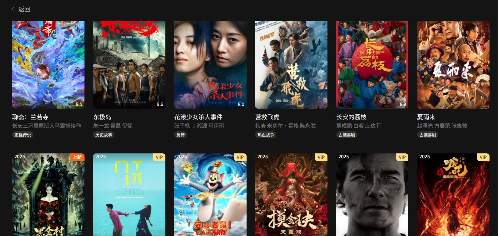
而针对使用wordpresss程序做的网站,要想实现这样的功能效果其实也并不难,以下是几种常见的在WordPress 中实现文章列表的瀑布流布局的方法,可以根据需要进行搭配使用。
方法一:使用 CSS 实现基础瀑布流
将以下代码添加到你的主题样式文件(style.css)或自定义 CSS 区域:
/* 瀑布流容器 */
.masonry-grid {
    display: flex;
    margin-left: -15px; /* 调整 gutter 大小 */
    width: auto;
}

/* 瀑布流列 */
.masonry-column {
    padding-left: 15px; /* 调整 gutter 大小 */
    background-clip: padding-box;
}

/* 瀑布流项目 */
.masonry-item {
    margin-bottom: 15px; /* 调整项目间距 */
    width: 100%;
}

/* 确保图片自适应 */
.masonry-item img {
    width: 100%;
    height: auto;
    display: block;
}
然后在你的主题模板文件(如 archive.php 或 index.php)中添加:
<div class="masonry-grid">
    <?php
    $columns = 3; // 设置列数
    for ($i = 0; $i < $columns; $i++): ?>
        <div class="masonry-column">
            <?php
            $post_count = 0;
            while (have_posts()) : the_post();
                if ($post_count % $columns == $i): ?>
                    <div class="masonry-item">
                        <article id="post-<?php the_ID(); ?>" <?php post_class(); ?>>
                            <!-- 你的文章内容模板 -->
                            <a href="<?php the_permalink(); ?>">
                                <?php if (has_post_thumbnail()) {
                                    the_post_thumbnail('medium');
                                } ?>
                                <h2><?php the_title(); ?></h2>
                            </a>
                            <div class="entry-content">
                                <?php the_excerpt(); ?>
                            </div>
                        </article>
                    </div>
                <?php
                endif;
                $post_count++;
            endwhile; ?>
        </div>
    <?php endfor; ?>
</div>
方法二:使用 jQuery Masonry 插件
- 首先在 functions.php 中加载 Masonry 库:
function enqueue_masonry_script() {
    wp_enqueue_script('masonry');
    wp_enqueue_script('imagesloaded');
}
add_action('wp_enqueue_scripts', 'enqueue_masonry_script');- 添加 CSS:
.masonry-grid {
    margin: 0 auto;
}

.masonry-item {
    width: 30%; /* 调整宽度 */
    margin-bottom: 20px;
    float: left;
}

.masonry-item img {
    width: 100%;
    height: auto;
}- 在模板文件中:
<div class="masonry-grid">
    <?php while (have_posts()) : the_post(); ?>
        <div class="masonry-item">
            <article id="post-<?php the_ID(); ?>" <?php post_class(); ?>>
                <!-- 你的文章内容模板 -->
                <a href="<?php the_permalink(); ?>">
                    <?php if (has_post_thumbnail()) {
                        the_post_thumbnail('medium');
                    } ?>
                    <h2><?php the_title(); ?></h2>
                </a>
                <div class="entry-content">
                    <?php the_excerpt(); ?>
                </div>
            </article>
        </div>
    <?php endwhile; ?>
</div>

<script>
jQuery(document).ready(function($) {
    var $grid = $('.masonry-grid').masonry({
        itemSelector: '.masonry-item',
        columnWidth: '.masonry-item',
        percentPosition: true
    });

    // 确保图片加载完成后重新布局
    $grid.imagesLoaded().progress(function() {
        $grid.masonry('layout');
    });
});
</script>
方法三:使用 CSS Grid 实现(现代浏览器支持)
.masonry-grid {
    display: grid;
    grid-template-columns: repeat(auto-fill, minmax(300px, 1fr));
    grid-gap: 15px;
    grid-auto-rows: masonry;
}

.masonry-item {
    break-inside: avoid;
    margin-bottom: 15px;
}

.masonry-item img {
    width: 100%;
    height: auto;
}
注意事项
- 瀑布流布局对图片高度不一致的内容效果最好
- 考虑移动端响应式设计,可能需要调整列数
- 如果使用插件方法,确保 WordPress 已经加载了 jQuery
- 对于大量文章,可能需要实现无限滚动或分页加载
你可以根据你的主题和需求选择最适合的方法,或者结合使用这些技术来获得最佳效果。