8种JavaScript动画效果特效代码
8种JavaScript动画效果特效代码,欢迎免费使用。
JavaScript动画特效效果在我们的编程开发中经常用到,以下提供了八种常见的JavaScript动画特效效果,包含完整的代码和说明,你可以免费使用这些JavaScript动画特效效果。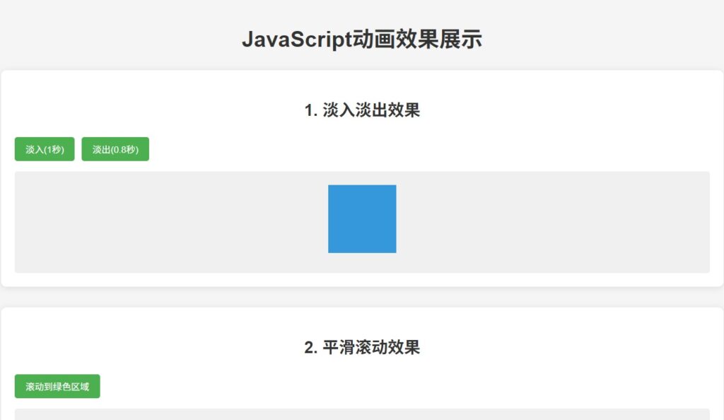
动画特效效果html完整代码,复制到html相关软件保存成页面即可查看相关效果。同时你还可以免费使用这些JavaScript动画特效。
<!DOCTYPE html>
<html lang="zh-CN">
<head>
<meta charset="UTF-8">
<meta name="viewport" content="width=device-width, initial-scale=1.0">
<title>JavaScript动画效果展示</title>
<style>
* {
margin: 0;
padding: 0;
box-sizing: border-box;
font-family: 'Arial', sans-serif;
}
body {
background-color: #f5f5f5;
color: #333;
line-height: 1.6;
padding: 20px;
}
h1, h2 {
margin: 20px 0;
text-align: center;
}
.container {
max-width: 1200px;
margin: 0 auto;
}
.demo-section {
background-color: white;
border-radius: 8px;
padding: 20px;
margin-bottom: 30px;
box-shadow: 0 2px 10px rgba(0, 0, 0, 0.1);
}
.controls {
display: flex;
gap: 10px;
margin-bottom: 15px;
flex-wrap: wrap;
}
button {
padding: 8px 16px;
background-color: #4CAF50;
color: white;
border: none;
border-radius: 4px;
cursor: pointer;
transition: background-color 0.3s;
}
button:hover {
background-color: #45a049;
}
.animation-box {
width: 100%;
min-height: 150px;
background-color: #f0f0f0;
border-radius: 4px;
position: relative;
overflow: hidden;
}
#fadeElement {
width: 100px;
height: 100px;
background-color: #3498db;
display: none;
margin: 20px auto;
}
#followElement {
width: 30px;
height: 30px;
background-color: #e74c3c;
border-radius: 50%;
position: absolute;
top: 50%;
left: 50%;
transform: translate(-50%, -50%);
}
#typingElement {
font-size: 1.2rem;
padding: 20px;
min-height: 60px;
}
.parallax-container {
height: 300px;
position: relative;
overflow: hidden;
}
.parallax-layer {
position: absolute;
width: 100%;
height: 100%;
display: flex;
justify-content: center;
align-items: center;
font-size: 2rem;
font-weight: bold;
color: white;
}
.parallax-layer1 {
background-color: rgba(52, 152, 219, 0.7);
z-index: 1;
}
.parallax-layer2 {
background-color: rgba(231, 76, 60, 0.7);
z-index: 2;
}
.parallax-layer3 {
background-color: rgba(46, 204, 113, 0.7);
z-index: 3;
}
#particleContainer {
height: 200px;
}
#animatedElement {
width: 100px;
height: 100px;
background-color: #9b59b6;
margin: 20px auto;
}
#flipCardContainer {
height: 320px;
display: flex;
justify-content: center;
align-items: center;
}
.scroll-section {
height: 800px;
}
.scroll-target {
height: 300px;
background-color: #2ecc71;
display: flex;
justify-content: center;
align-items: center;
color: white;
font-size: 1.5rem;
margin-top: 500px;
}
</style>
</head>
<body>
<div class="container">
<h1>JavaScript动画效果展示</h1>
<!-- 淡入淡出效果 -->
<div class="demo-section">
<h2>1. 淡入淡出效果</h2>
<div class="controls">
<button onclick="fadeIn(document.getElementById('fadeElement'), 1000)">淡入(1秒)</button>
<button onclick="fadeOut(document.getElementById('fadeElement'), 800)">淡出(0.8秒)</button>
</div>
<div class="animation-box">
<div id="fadeElement"></div>
</div>
</div>
<!-- 平滑滚动 -->
<div class="demo-section">
<h2>2. 平滑滚动效果</h2>
<div class="controls">
<button onclick="smoothScrollTo('.scroll-target', 1500)">滚动到绿色区域</button>
</div>
<div class="animation-box scroll-section">
<div class="scroll-target">滚动目标区域</div>
</div>
</div>
<!-- 元素跟随鼠标 -->
<div class="demo-section">
<h2>3. 元素跟随鼠标</h2>
<div class="controls">
<button onclick="followMouse('followElement')">启用跟随效果</button>
</div>
<div class="animation-box" style="height: 200px;">
<div id="followElement"></div>
</div>
</div>
<!-- 打字机效果 -->
<div class="demo-section">
<h2>4. 打字机效果</h2>
<div class="controls">
<button onclick="typeWriter('typingElement', '这是一个打字机效果的文字展示,可以自定义显示速度和内容...', 100)">开始打字</button>
<button onclick="document.getElementById('typingElement').textContent = ''">清空</button>
</div>
<div class="animation-box">
<div id="typingElement"></div>
</div>
</div>
<!-- 视差滚动效果 -->
<div class="demo-section">
<h2>5. 视差滚动效果</h2>
<div class="controls">
<button onclick="initParallax()">启用视差效果</button>
<button onclick="window.location.reload()">重置</button>
</div>
<div class="animation-box parallax-container">
<div class="parallax-layer parallax-layer1">第一层</div>
<div class="parallax-layer parallax-layer2">第二层</div>
<div class="parallax-layer parallax-layer3">第三层</div>
</div>
</div>
<!-- 粒子动画 -->
<div class="demo-section">
<h2>6. 粒子动画效果</h2>
<div class="controls">
<button onclick="createParticles('particleContainer', 50)">生成50个粒子</button>
<button onclick="document.getElementById('particleContainer').innerHTML = ''">清除粒子</button>
</div>
<div class="animation-box" id="particleContainer"></div>
</div>
<!-- Web Animations API -->
<div class="demo-section">
<h2>7. Web Animations API</h2>
<div class="controls">
<button onclick="animateWithWAAPI('animatedElement')">开始动画</button>
<button onclick="document.getElementById('animatedElement').getAnimations().forEach(anim => anim.cancel())">停止动画</button>
</div>
<div class="animation-box">
<div id="animatedElement"></div>
</div>
</div>
<!-- 3D卡片翻转 -->
<div class="demo-section">
<h2>8. 3D卡片翻转效果</h2>
<div class="controls">
<button onclick="create3DFlipCard('flipCardContainer')">创建翻转卡片</button>
</div>
<div class="animation-box" id="flipCardContainer"></div>
</div>
</div>
<script>
// 1. 淡入淡出效果
function fadeIn(element, duration = 500) {
element.style.opacity = 0;
element.style.display = 'block';
let start = null;
function step(timestamp) {
if (!start) start = timestamp;
const progress = timestamp - start;
const opacity = Math.min(progress / duration, 1);
element.style.opacity = opacity;
if (progress < duration) {
window.requestAnimationFrame(step);
}
}
window.requestAnimationFrame(step);
}
function fadeOut(element, duration = 500) {
let start = null;
function step(timestamp) {
if (!start) start = timestamp;
const progress = timestamp - start;
const opacity = 1 - Math.min(progress / duration, 1);
element.style.opacity = opacity;
if (progress < duration) {
window.requestAnimationFrame(step);
} else {
element.style.display = 'none';
}
}
window.requestAnimationFrame(step);
}
// 2. 平滑滚动
function smoothScrollTo(target, duration = 1000) {
const targetElement = document.querySelector(target);
if (!targetElement) return;
const targetPosition = targetElement.getBoundingClientRect().top + window.pageYOffset;
const startPosition = window.pageYOffset;
const distance = targetPosition - startPosition;
let startTime = null;
function animation(currentTime) {
if (startTime === null) startTime = currentTime;
const timeElapsed = currentTime - startTime;
const run = easeInOutQuad(timeElapsed, startPosition, distance, duration);
window.scrollTo(0, run);
if (timeElapsed < duration) requestAnimationFrame(animation);
}
function easeInOutQuad(t, b, c, d) {
t /= d / 2;
if (t < 1) return c / 2 * t * t + b;
t--;
return -c / 2 * (t * (t - 2) - 1) + b;
}
requestAnimationFrame(animation);
}
// 3. 元素跟随鼠标
function followMouse(elementId) {
const element = document.getElementById(elementId);
if (!element) return;
let mouseX = 0, mouseY = 0;
let posX = 0, posY = 0;
const speed = 0.05;
function animate() {
const distX = mouseX - posX;
const distY = mouseY - posY;
posX += distX * speed;
posY += distY * speed;
element.style.left = posX + 'px';
element.style.top = posY + 'px';
requestAnimationFrame(animate);
}
document.addEventListener('mousemove', (e) => {
mouseX = e.clientX;
mouseY = e.clientY;
});
animate();
}
// 4. 打字机效果
function typeWriter(elementId, text, speed = 100) {
const element = document.getElementById(elementId);
if (!element) return;
let i = 0;
element.textContent = '';
function typing() {
if (i < text.length) {
element.textContent += text.charAt(i);
i++;
setTimeout(typing, speed);
}
}
typing();
}
// 5. 视差滚动效果
function initParallax() {
const layers = [
{ selector: '.parallax-layer1', speed: 0.2 },
{ selector: '.parallax-layer2', speed: 0.5 },
{ selector: '.parallax-layer3', speed: 0.8 }
];
window.addEventListener('scroll', function() {
const scrollPosition = window.pageYOffset;
layers.forEach(layer => {
const element = document.querySelector(layer.selector);
if (element) {
const yPos = -(scrollPosition * layer.speed);
element.style.transform = `translate3d(0, ${yPos}px, 0)`;
}
});
});
}
// 6. 粒子动画效果
function createParticles(containerId, count = 100) {
const container = document.getElementById(containerId);
if (!container) return;
container.style.position = 'relative';
container.style.overflow = 'hidden';
for (let i = 0; i < count; i++) {
const particle = document.createElement('div');
particle.style.position = 'absolute';
particle.style.width = Math.random() * 5 + 2 + 'px';
particle.style.height = particle.style.width;
particle.style.backgroundColor = `hsl(${Math.random() * 360}, 100%, 50%)`;
particle.style.borderRadius = '50%';
particle.style.opacity = Math.random() * 0.5 + 0.1;
const posX = Math.random() * container.offsetWidth;
const posY = Math.random() * container.offsetHeight;
particle.style.left = posX + 'px';
particle.style.top = posY + 'px';
container.appendChild(particle);
animateParticle(particle, container);
}
function animateParticle(particle, container) {
let x = parseFloat(particle.style.left);
let y = parseFloat(particle.style.top);
const speedX = (Math.random() - 0.5) * 2;
const speedY = (Math.random() - 0.5) * 2;
function move() {
x += speedX;
y += speedY;
if (x < 0 || x > container.offsetWidth) {
x = Math.max(0, Math.min(x, container.offsetWidth));
particle.style.left = x + 'px';
return resetParticle();
}
if (y < 0 || y > container.offsetHeight) {
y = Math.max(0, Math.min(y, container.offsetHeight));
particle.style.top = y + 'px';
return resetParticle();
}
particle.style.left = x + 'px';
particle.style.top = y + 'px';
requestAnimationFrame(move);
}
function resetParticle() {
setTimeout(() => {
x = Math.random() * container.offsetWidth;
y = Math.random() * container.offsetHeight;
particle.style.left = x + 'px';
particle.style.top = y + 'px';
move();
}, 1000);
}
move();
}
}
// 7. Web Animations API
function animateWithWAAPI(elementId) {
const element = document.getElementById(elementId);
if (!element) return;
const keyframes = [
{ transform: 'translateX(0) rotate(0deg)', opacity: 1 },
{ transform: 'translateX(300px) rotate(360deg)', opacity: 0.5 },
{ transform: 'translateX(0) rotate(0deg)', opacity: 1 }
];
const options = {
duration: 2000,
iterations: Infinity,
easing: 'ease-in-out'
};
element.animate(keyframes, options);
}
// 8. 3D卡片翻转效果
function create3DFlipCard(containerId) {
const container = document.getElementById(containerId);
if (!container || container.querySelector('.flip-card')) return;
container.style.perspective = '1000px';
const card = document.createElement('div');
card.className = 'flip-card';
card.style.width = '200px';
card.style.height = '300px';
card.style.position = 'relative';
card.style.transformStyle = 'preserve-3d';
card.style.transition = 'transform 0.8s';
const front = document.createElement('div');
front.style.position = 'absolute';
front.style.width = '100%';
front.style.height = '100%';
front.style.backgroundColor = '#3498db';
front.style.backfaceVisibility = 'hidden';
front.style.display = 'flex';
front.style.justifyContent = 'center';
front.style.alignItems = 'center';
front.style.color = 'white';
front.textContent = '正面';
const back = document.createElement('div');
back.style.position = 'absolute';
back.style.width = '100%';
back.style.height = '100%';
back.style.backgroundColor = '#e74c3c';
back.style.transform = 'rotateY(180deg)';
back.style.backfaceVisibility = 'hidden';
back.style.display = 'flex';
back.style.justifyContent = 'center';
back.style.alignItems = 'center';
back.style.color = 'white';
back.textContent = '背面';
card.appendChild(front);
card.appendChild(back);
container.appendChild(card);
card.addEventListener('click', function() {
this.style.transform = this.style.transform.includes('rotateY(180deg)') ?
'rotateY(0deg)' : 'rotateY(180deg)';
});
}
</script>
</body>
</html>使用说明
- 将上述代码复制到一个HTML文件中(例如
animations.html) - 在浏览器中打开该文件
- 点击各个部分的按钮来体验不同的动画效果
功能特点
- 8种不同的动画效果:包括淡入淡出、平滑滚动、鼠标跟随、打字机效果、视差滚动、粒子动画、Web Animations API和3D卡片翻转
- 交互式演示:每个动画都有对应的控制按钮
- 响应式设计:适配不同屏幕尺寸
- 纯前端实现:不需要任何后端或外部依赖
- 现代动画技术:使用了requestAnimationFrame和Web Animations API等现代API
您可以根据需要修改任何部分的样式或行为,或者将这些动画效果集成到您的项目中。